Updates to Mandrill App (already)
Version 2.0 replaces the tabbed interface with a brand-new left navigation, adds a full keyboard shortcut system, and makes font & theme customization faster than ever.


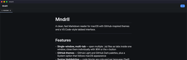
When I shipped Mandrill 1.0 last week, the goal was simple: give developers and technical writers the cleanest possible way to read Markdown on macOS. No accounts, no cloud sync, no cruft. Open a.md file, see it rendered beautifully, and get on with your work.
The response was encouraging. But there was one piece of feedback I kept hearing: tabs worked, but they weren't the right mental model for people who navigate between many files or want to keep their sidebar separate from their reading area. So I rebuilt it.
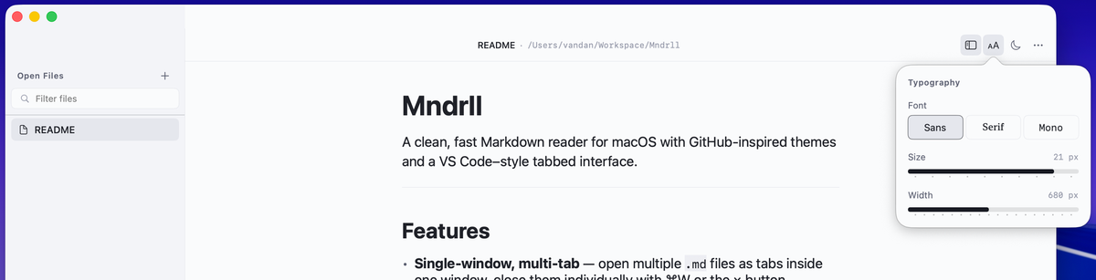
New: Left navigation panel
The tab bar is gone. In its place is a persistent left-hand navigation panel; a much more natural way to manage multiple open Markdown files. You can see all your documents at a glance, jump between them instantly, and keep your reading area completely clean.
The change might sound small, but it fundamentally shifts how the app feels to use. Instead of a browser-style top bar, you now have something closer to a proper document workspace the kind of focused, structured layout that tools like VS Code and Obsidian have proven works well for file-heavy workflows.
Keyboard shortcuts, finally
If you live at the keyboard, Mandrill 2.0 should feel like home. I've added a full set of shortcuts so you can navigate files, toggle the sidebar, and change your reading preferences without ever reaching for the mouse.
Easier font & theme controls
Reading comfort matters. In 2.0 I've made it quicker to dial in exactly how you want your Markdown to look. Font size, typeface, and theme; GitHub Light, GitHub Dark, or System (which follows your macOS appearance automatically). These are all a shortcut or one-click away.
This was always the pitch for Mandrill, and 2.0 makes it feel even more true. Less time fiddling with settings, more time actually reading.
Privacy, by design
Zero data collected. Mandrill has no analytics, no crash reporting that phones home, no accounts. The App Store listing reflects this: the developer collects no data from the app, period. What you read stays on your Mac.
What's next
I'm already thinking about what comes after 2.0. A few things on the list: better support for internal Markdown links, and possibly a way to open folders so you can browse a whole documentation tree in the sidebar.
If you have a feature request or you've run into a bug, reach out; I read everything. And if Mandrill is useful to you, an App Store review genuinely helps other developers find it.